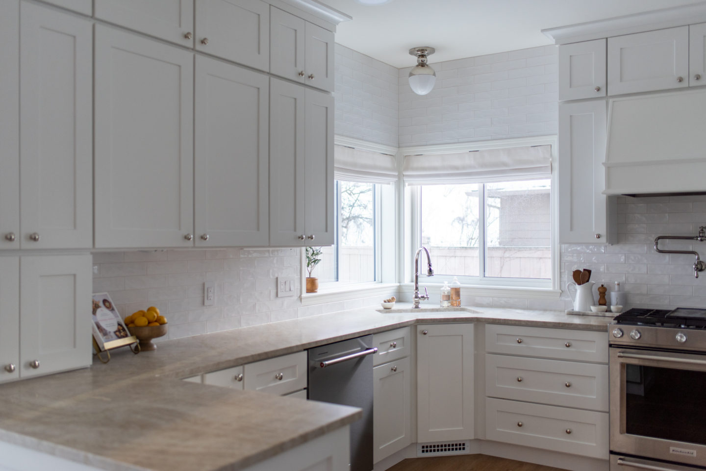
When we purchased our house last summer, we knew that the kitchen needed a total overhaul. Thankfully we were able to tackle the project pretty early on in our renovations, unlike in our last home where we renovated the kitchen and then had to move a few months after. We completely finished the kitchen in November (that’s when the last fixture got installed) but life got away from me during the holidays so I am just getting around to sharing it now.
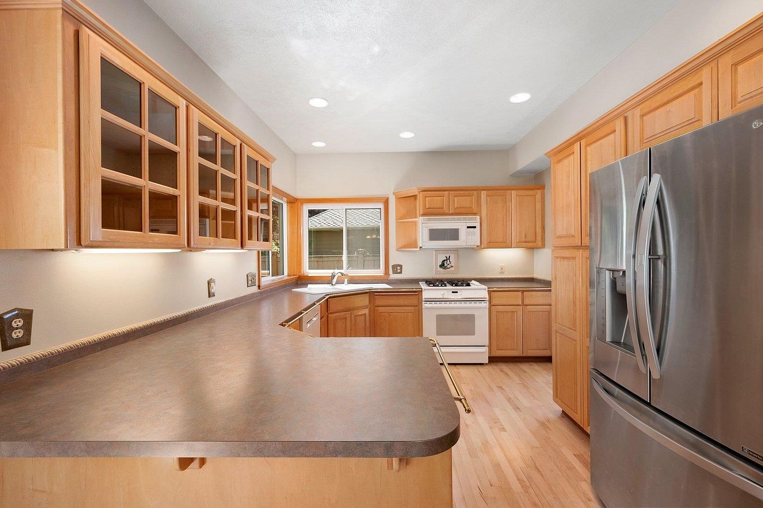
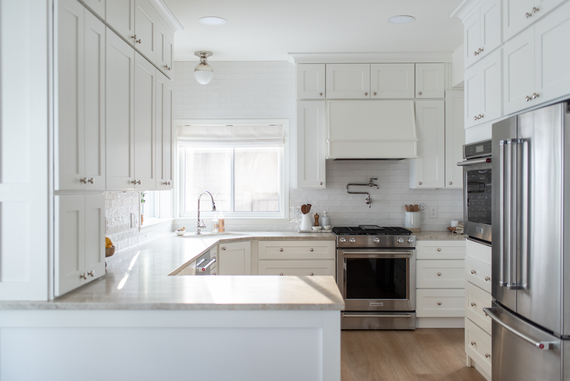
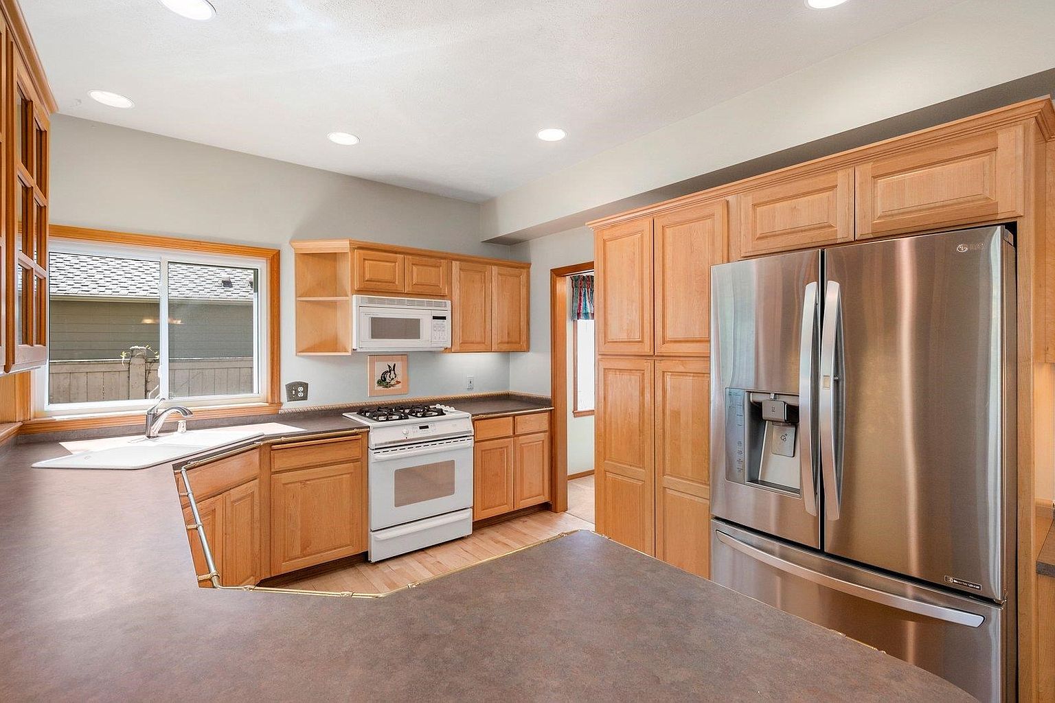
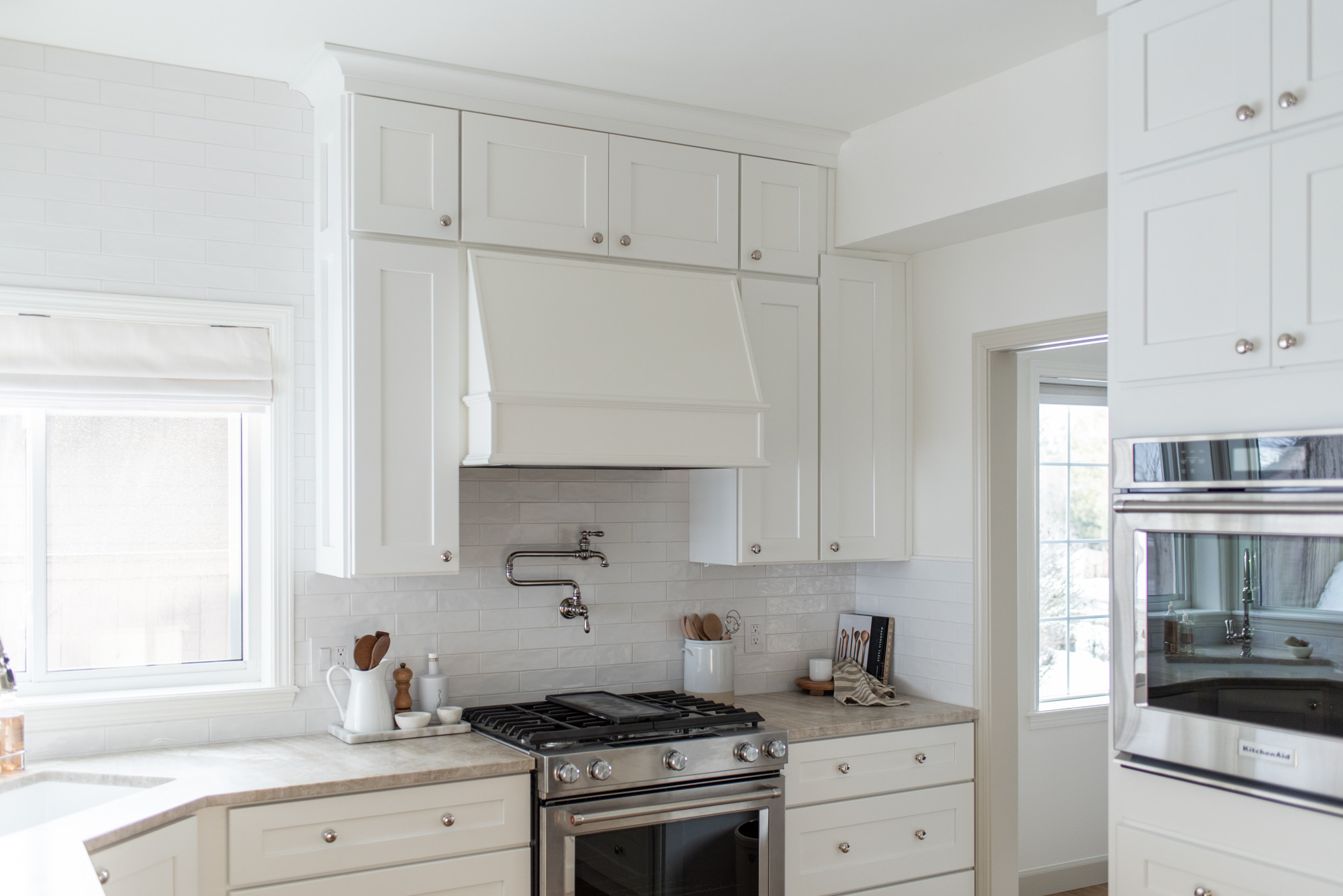
Before, and after. This corner of the house gets quite dark due to a very large and beloved oak tree in the backyard, so it’s now light and bright. We also took the cabinetry all of the way to the ceiling, and added quite a but more storage by doing so. While we completely gutted the kitchen, we kept the basic layout the same, but added in an additional wall oven where previously there were pantry cabinets, and added pantry cabinets further down where there was a built in desk.
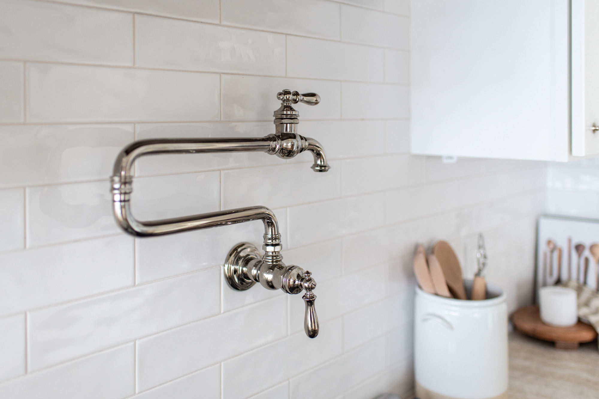
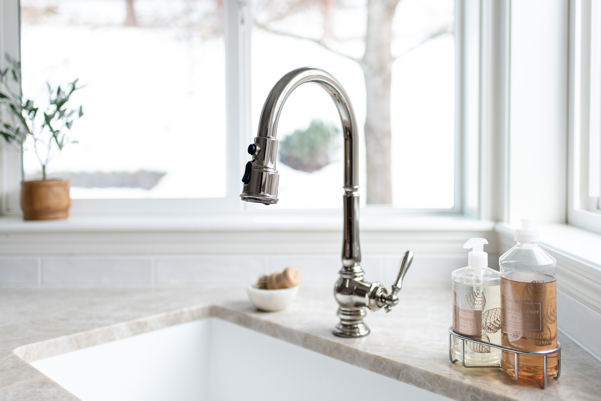
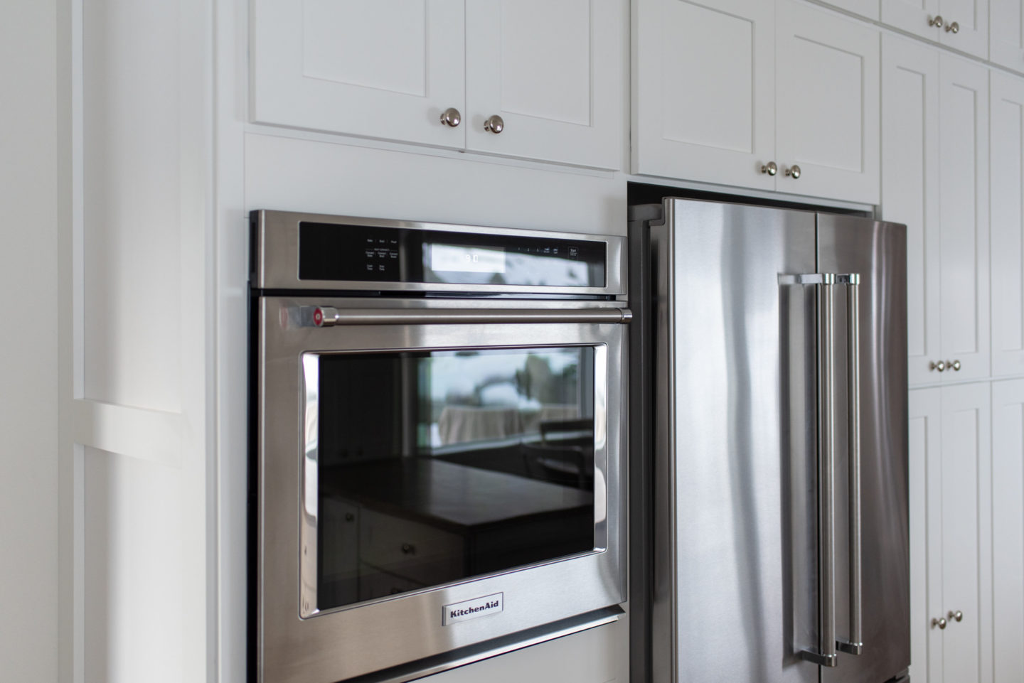
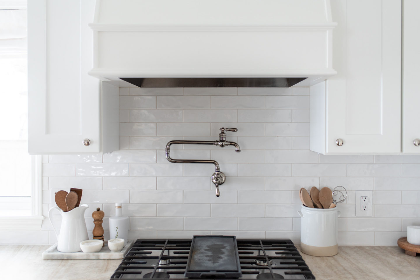
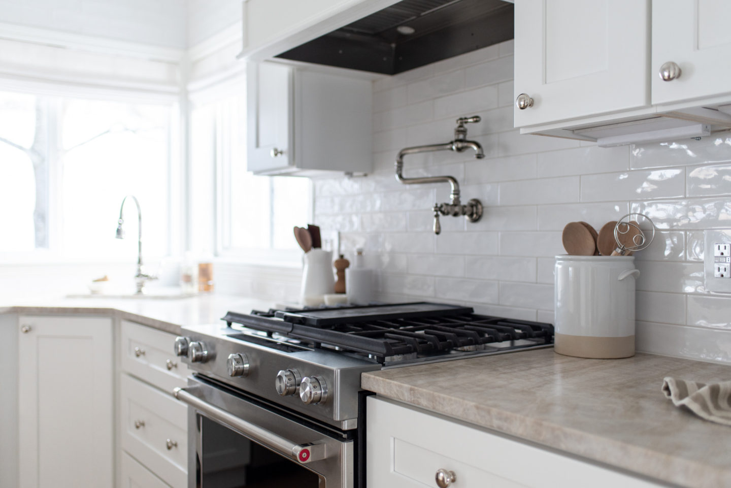
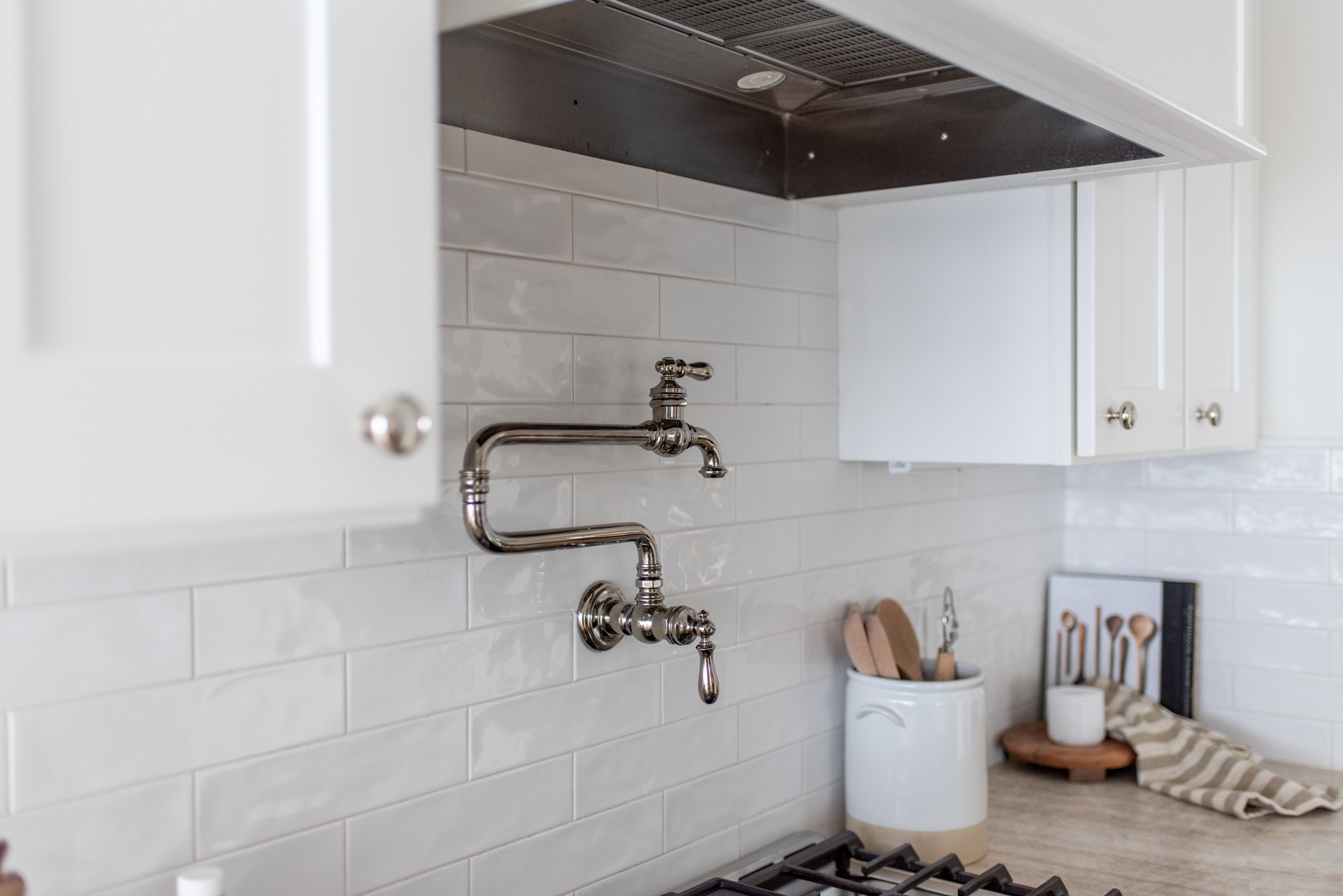
So far we love the KitchenAid appliances. We also added in a pot filler above the range. Was it necessary in such a small kitchen? No. Do I love it? Yes.
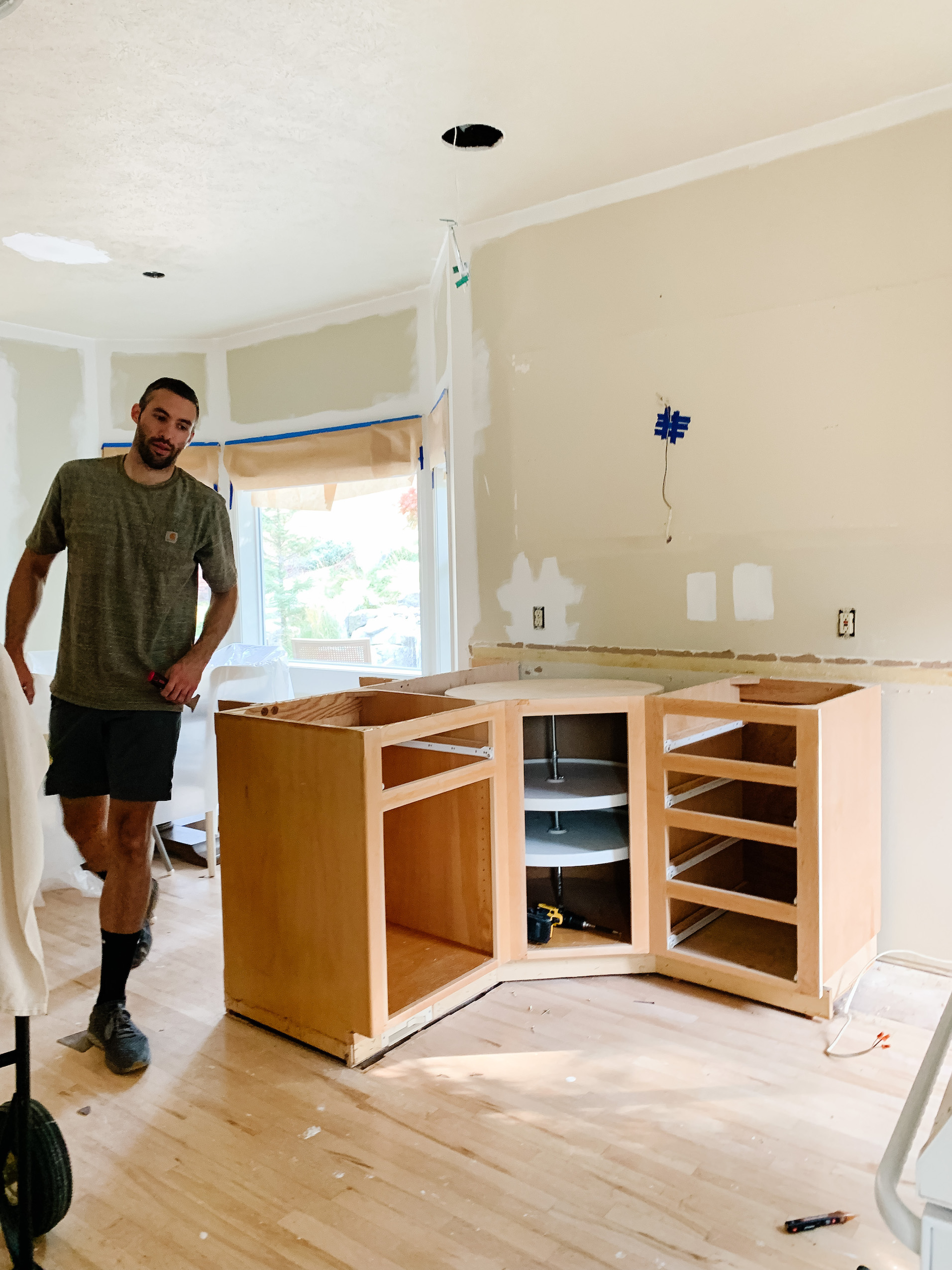
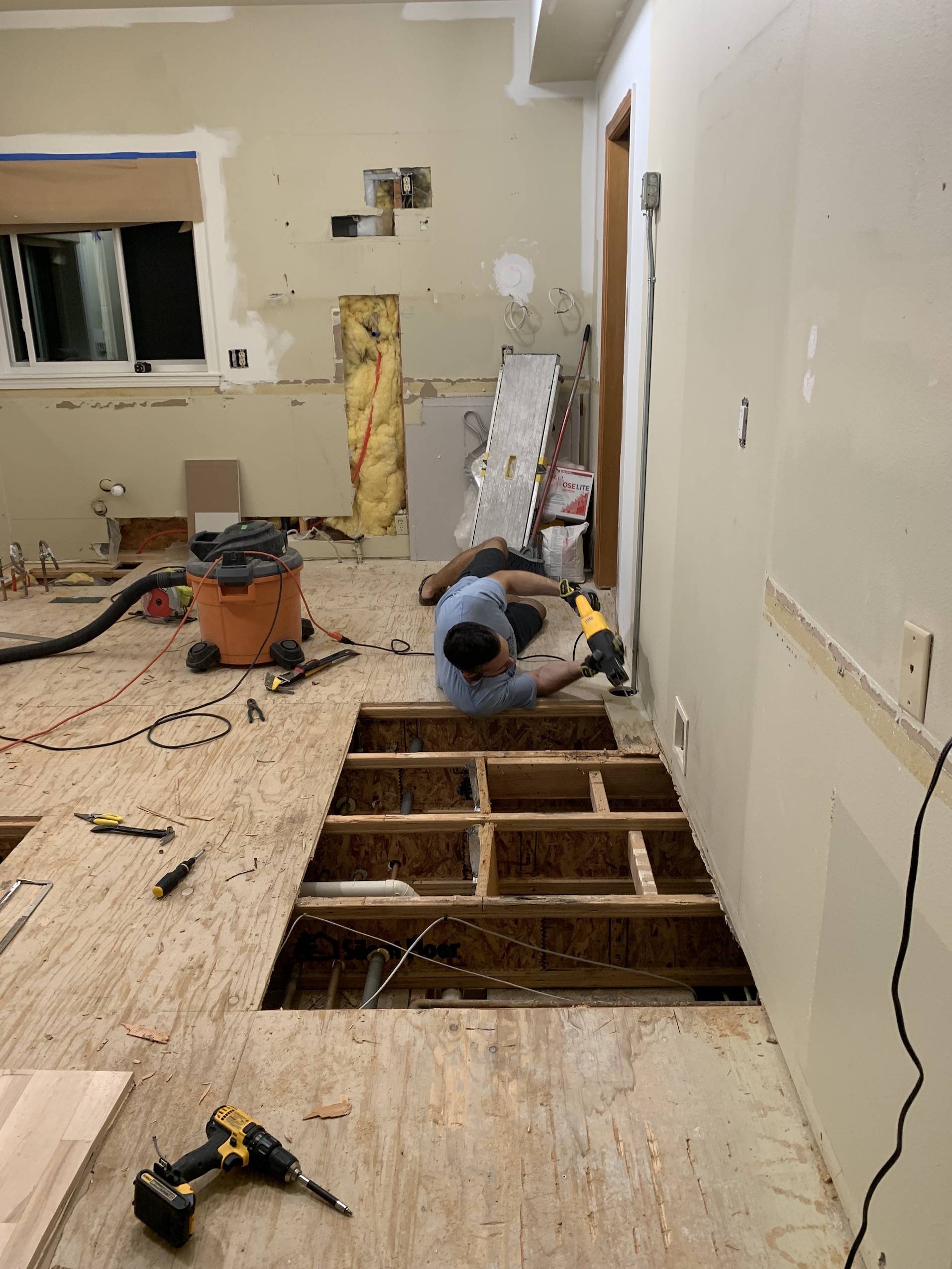
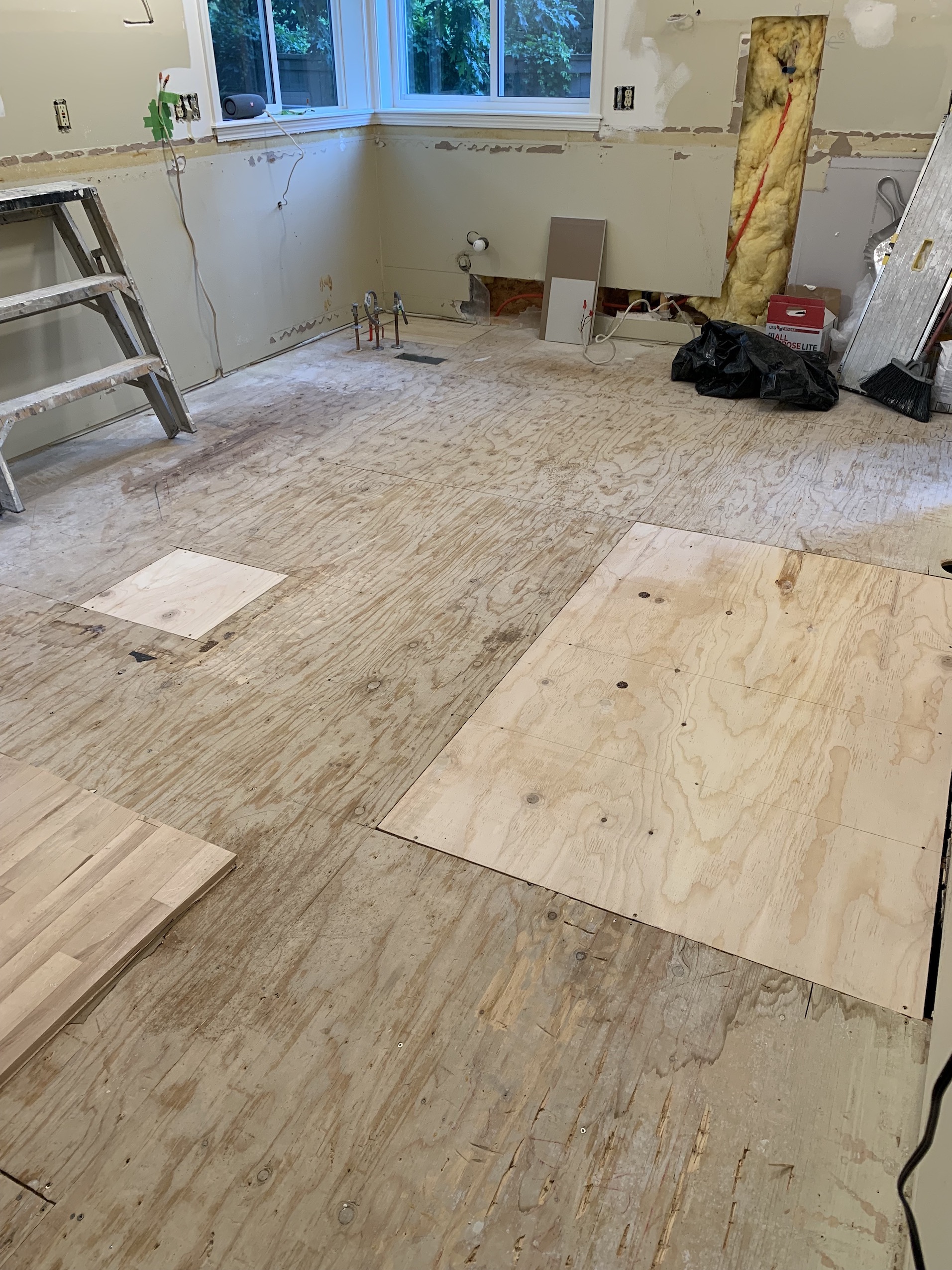
One of the ways we saved money on this renovation was buy doing all of the demo work ourselves. And by we I obviously mean James. He also did all the demo work in our previous home. This kitchen required a bit more as we pulled up the flooring in preparation for the new floors going in after the cabinets (we also changed the layout of the cabinets just enough that the floors needed to get moved regardless). During the demo process, we realized that the fridge had leaked at one point and had gotten into the subfloor, so we took the time to replace that section of sub-flooring and make sure everything was dry and ready for new cabinets and appliances.
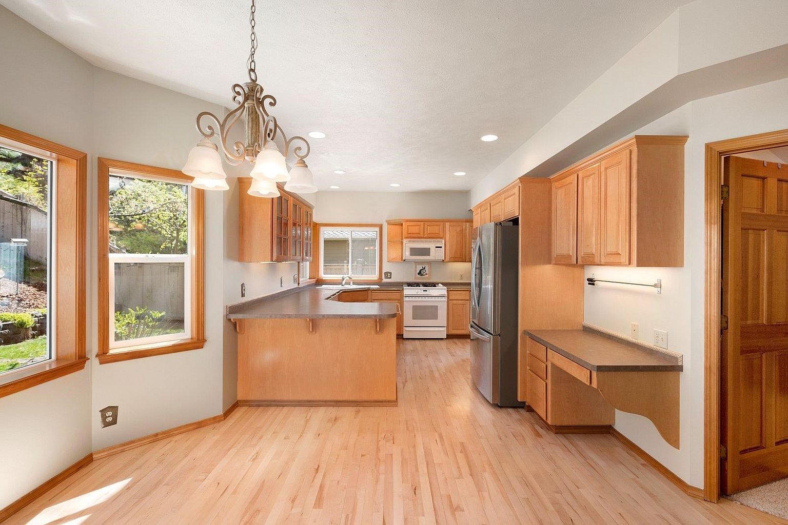
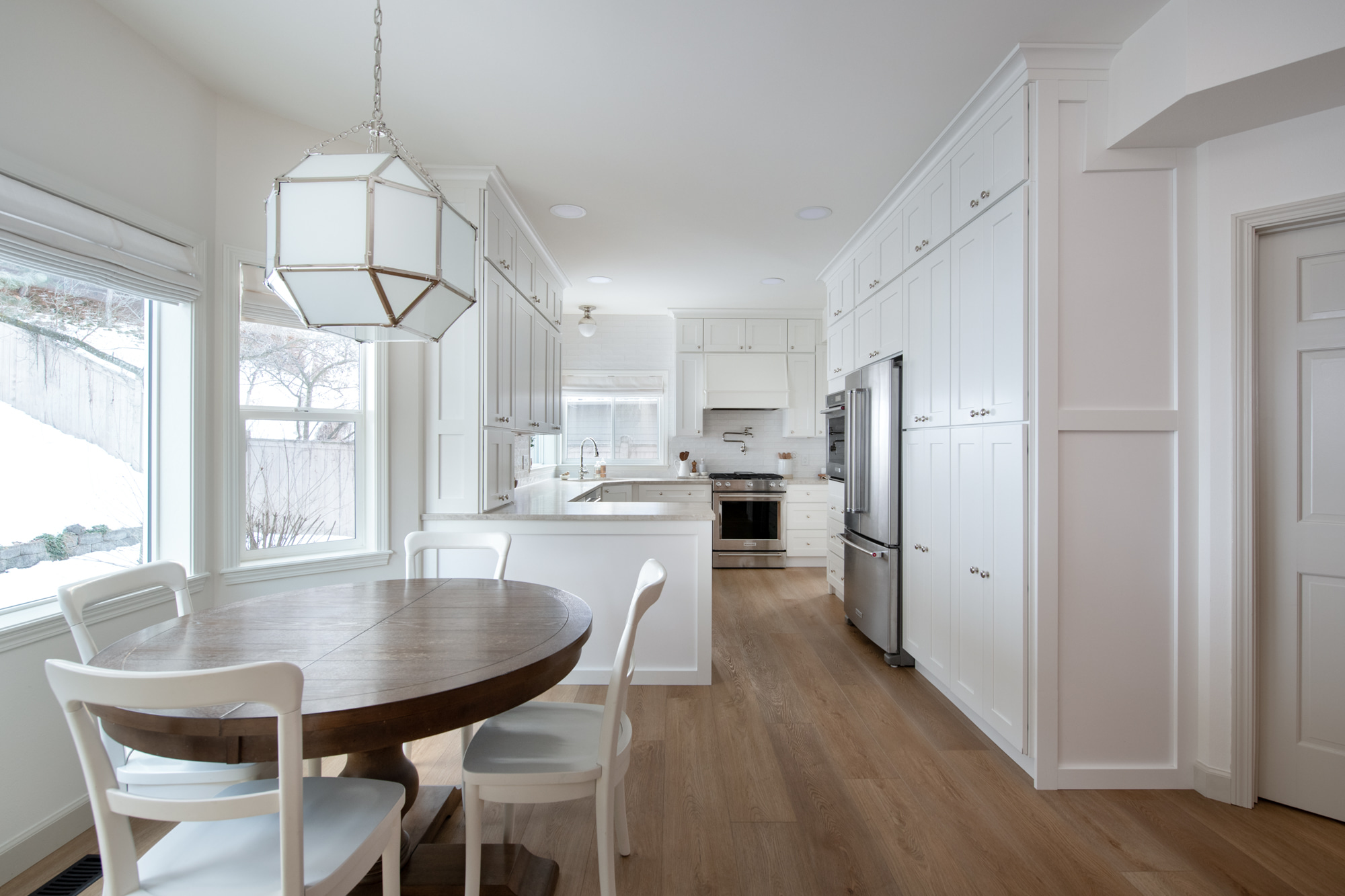
We brought the cabinetry out a bit further towards the breakfast nook and eliminated the overhang since it seemed redundant with the table right there (and we also have a formal dining room). Where there previously was a built in desk we added two floor to ceiling pantry cabinets (the microwave is also now hidden in there) for tons of functional storage. We changed out the lighting in the breakfast nook, as well as went to town painting. You can also see from the above picture that we used the small upper cabinets to hide the HVAC bulkhead. I would have loved to gotten rid of it, but it just wasn’t in the budget to reroute HVAC. Thankfully this is the only room (other than the basement) where there is a bulkhead, and I feel like the cabinetry did wonders to hide the majority of it.
We also switched out the old can lighting for LEDs, and switched one out for a flush-mount (a few of the others had to be shifted over to accommodate for the cabinetry now going to the ceiling).
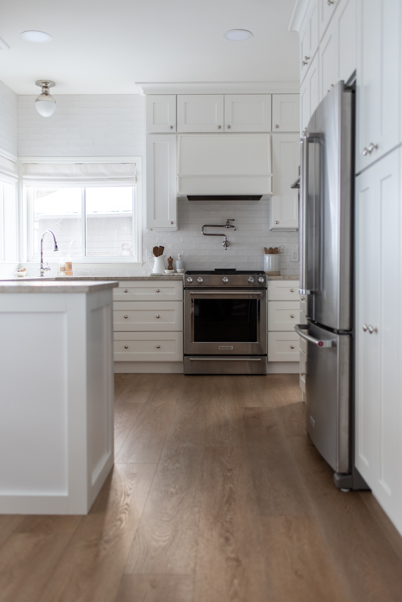
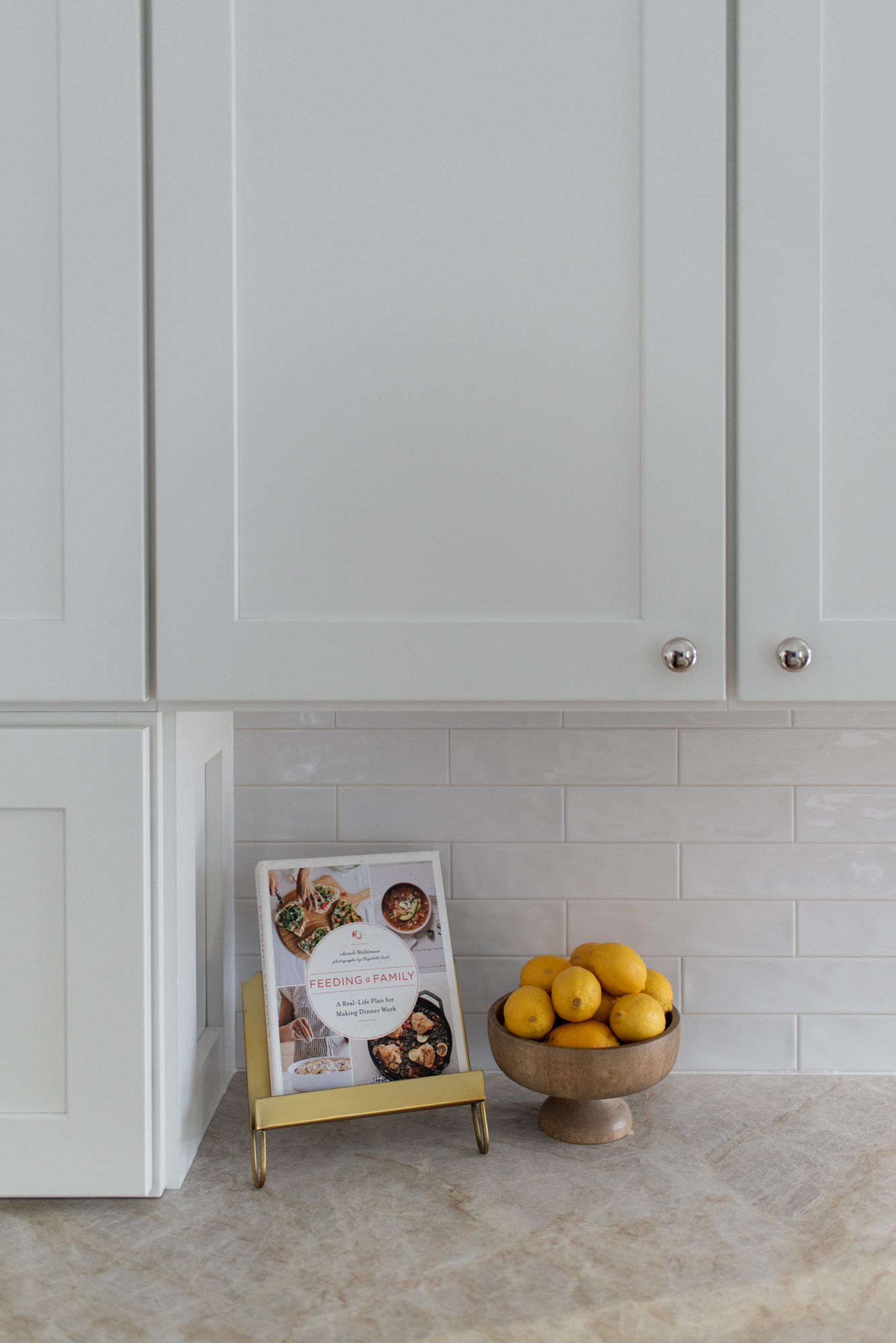
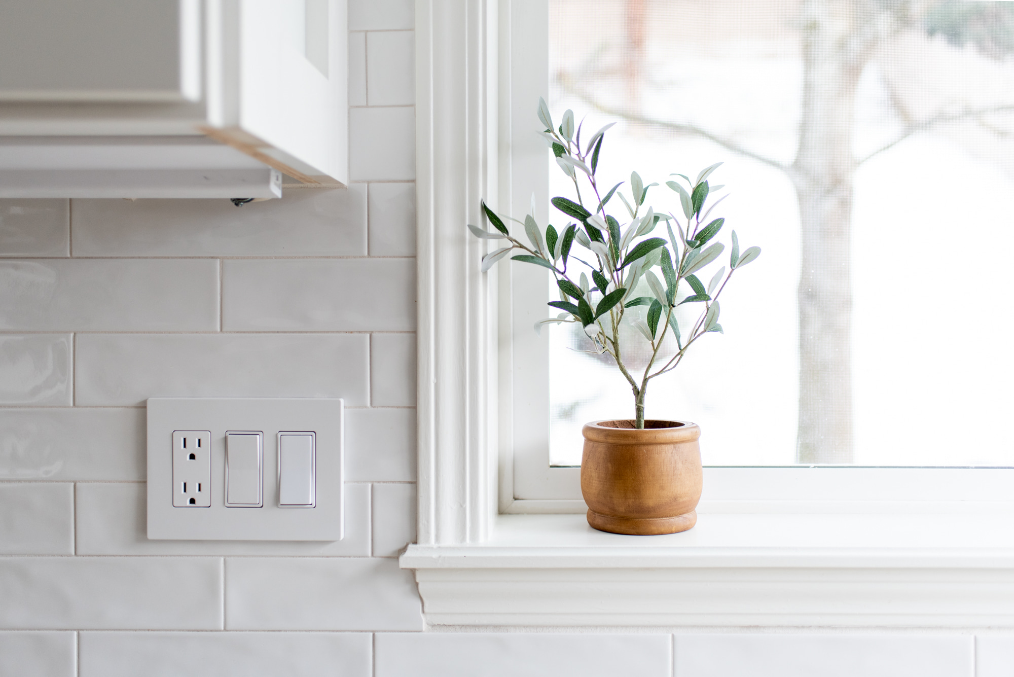
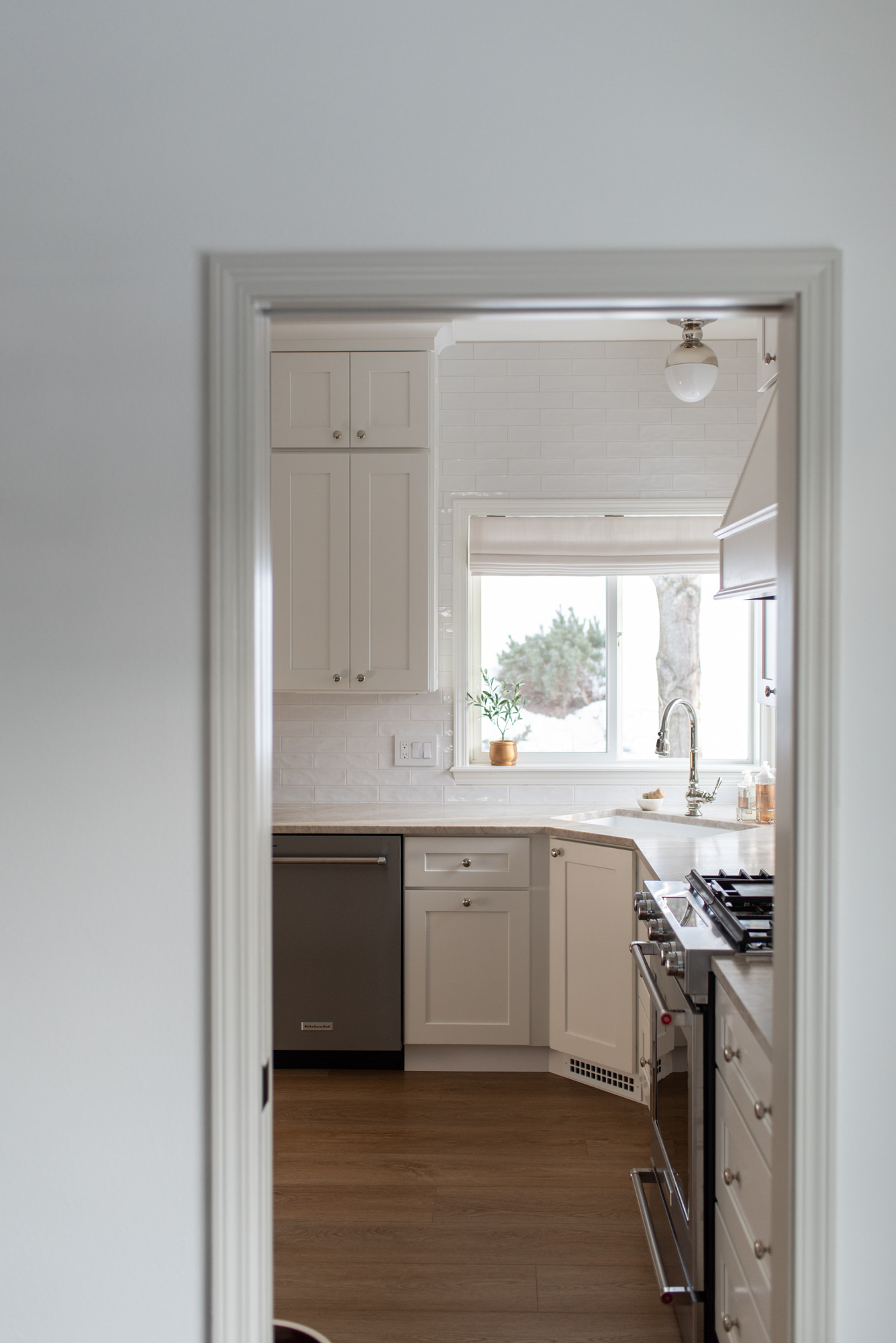
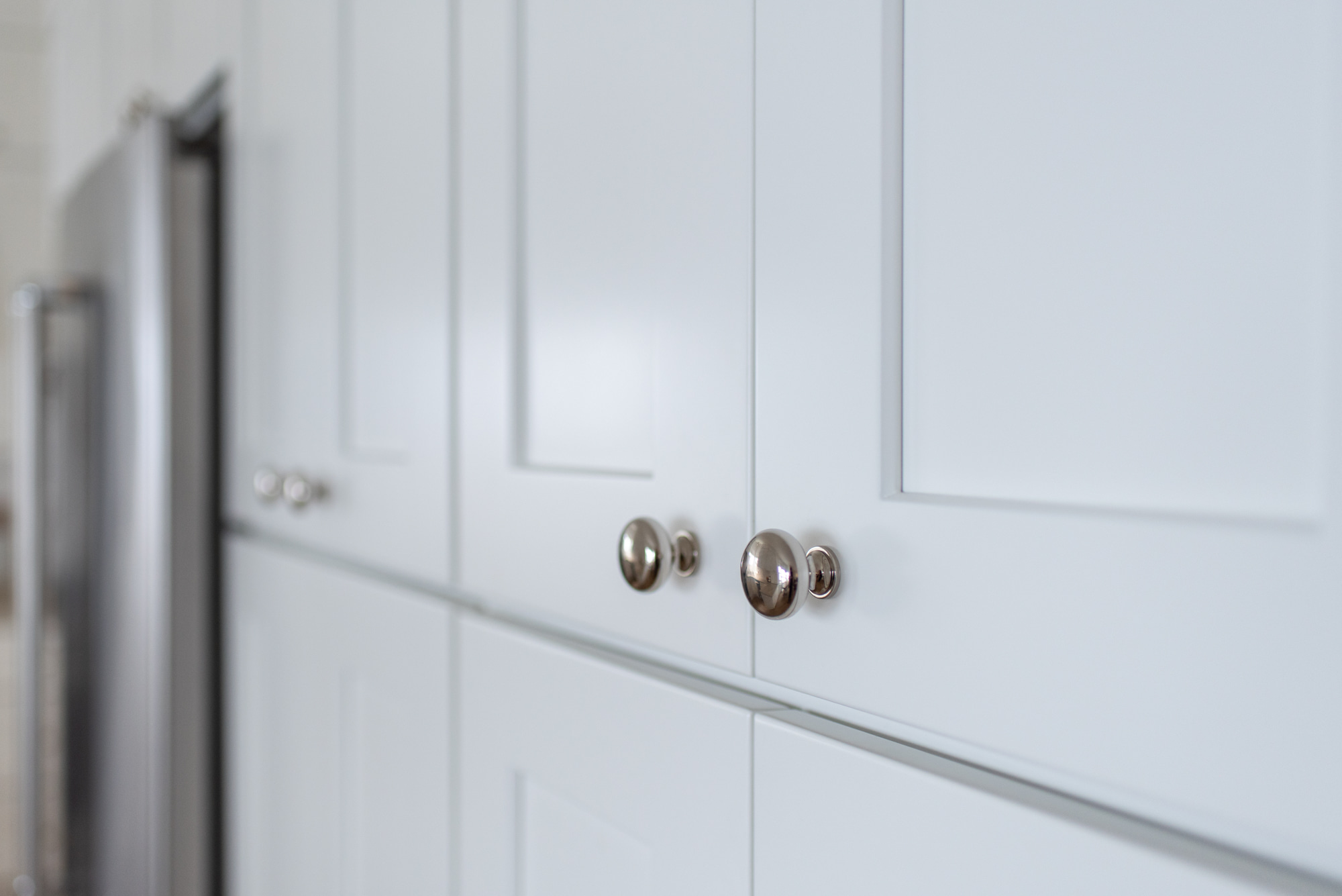
The hardware throughout the kitchen is from Rejuvenation. The backsplash tile is from Bedrosians. The last go around James did the backsplash himself and to be honest I wish he had done it this time too- I feel like there was more attention to detail from him then our professional installer for this kitchen. The countertops are a leathered Taj Mahal Quartzite and I am completely in love with them.
All in all I am very happy with the way the kitchen turned out. Working within my constraints (available square footage and budget) we were able to create a much more functional, and beautiful kitchen for our home.
And a big thank you to Kayleen Michelle for the wonderful photos of the kitchen!
