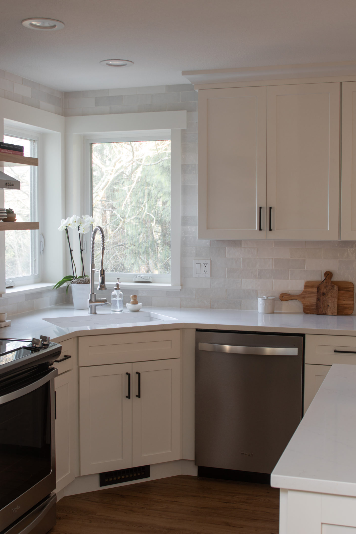
Our kitchen is finally done! And just in time to list our house before we move- I wish I were kidding. We at least get to enjoy it for a few months before moving on, and see it belong to someone else who will hopefully enjoy it as much as we have.
Below is the before on the left, and the finished room on the right. We kept the same basic layout since there were really no other options (short of some major renovations that simply weren’t in the budget for this project). We did expand the island, and add a much needed counter overhang to have a breakfast bar.
While we did (read: James) did the cabinetry install ourselves in our mudroom project, we decided it was in the budget and beneficial to our timeline to have the cabinetry professionally designed and installed for the kitchen. We went with a simple white shaker style like we did in the mudroom, and I am very happy with the way it turned out. I love that our home backs up to a wooded space, but those same beautiful trees also block a lot of light, so the lighter toned kitchen really helped to brighten up the space.
The pendant lights are from Crate and Barrel, and the cabinetry hardware is from Wayfair.
While we kept the layout of the kitchen almost identical to before, we did reconfigure the space next to the refrigerator. There was previously what was essentially a linen closet to the right of the fridge, and it was not a useful space, and it also make the area felt very disjointed from the rest of the kitchen. In addition, the cabinet above the fridge was set so far back that it was almost completely unusable.
We really wanted to have a cabinetry surround in this space, and once we determined that the closet wall wasn’t load bearing, James went to town ripping it out and prepping the space for the cabinet install. I should add that James did all of the demo on the old kitchen, which I think he had way too much fun with…
The finished cabinetry surround. It makes the refrigerator wall feel tied into the rest of the kitchen, and adds a lot more storage. We also relocated the microwave to this area (the square cabinet door on the right is where we put a small microwave). It was previously above the stove, and was big, unsightly, and immediately dated the kitchen.
While we left the cabinetry to the professionals, we did tackle the backsplash and floating shelves on our own. After doing the tile floors in the mudroom, James felt confident in his tiling abilities and in my opinion, knocked it out of the park with the kitchen. The tile is the Cloe Wall Tile in White from Bedrosians Tile & Stone. We were a little worried about so much white in the space (cabinets, countertops, and backsplash), but the tile is so varied in color and texture that it didn’t make the space too monochromatic, and really helps offset the darkness of the space from the lack of natural light.
I found the brackets for the floating shelves on Etsy, and the shop allows you to customize the width/depth. We did have to cut out some of the wall and add some reinforcing 2 x 4s, since otherwise the brackets risked sagging, and we wanted to be able to load up the shelves and not worry.
The floating shelves are white oak, and I am so happy with the way that they turned out. I was expecting to get a decent piece of wood to stain and seal from a big box store, but James (being a perfectionist), found a local hardwood importer where we could go and pick out our plank and have it planed down. The end result required absolutely no staining (just a matte sealant), and adds some much needed warmth to the kitchen.
Below is a shot of the same angle, before, during construction, and after.
This kitchen was our first major renovation we ever tackled, and I am so happy with the way it turned out. While it took us a little longer than anticipated to complete, we managed to stay in our budget, and bring our kitchen into the 21st century. My only regret is not renovating sooner, since now we only have a few months to appreciate it before we list the house.